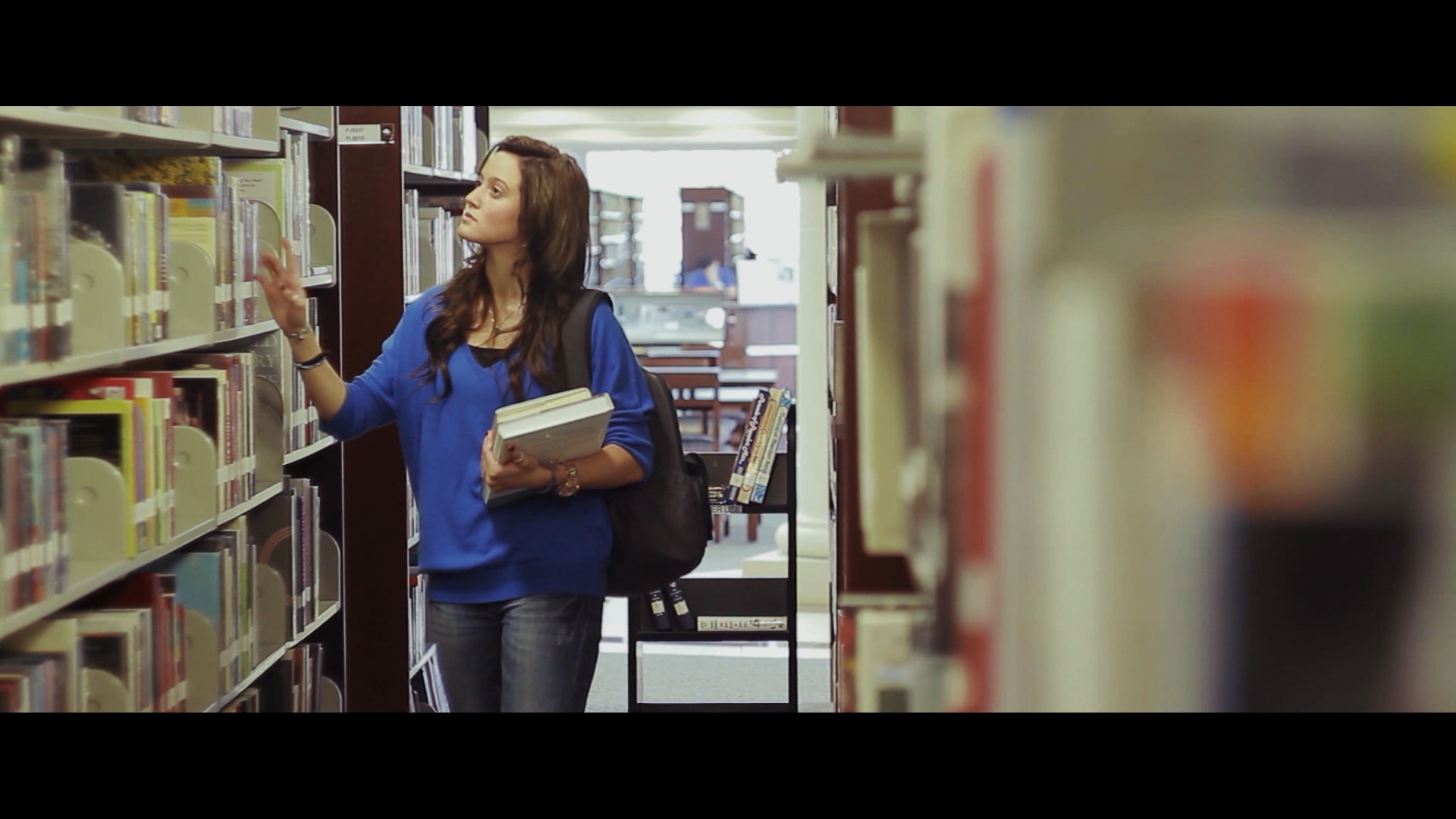
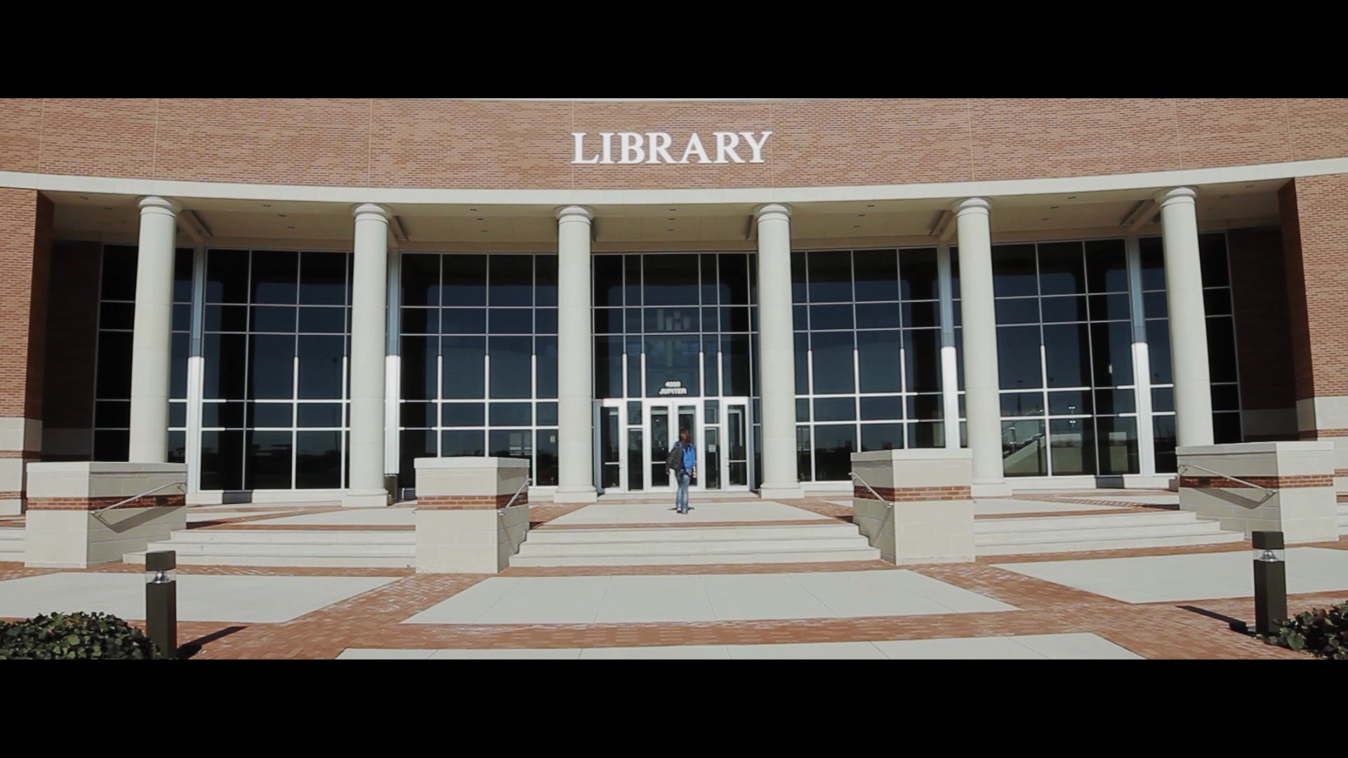
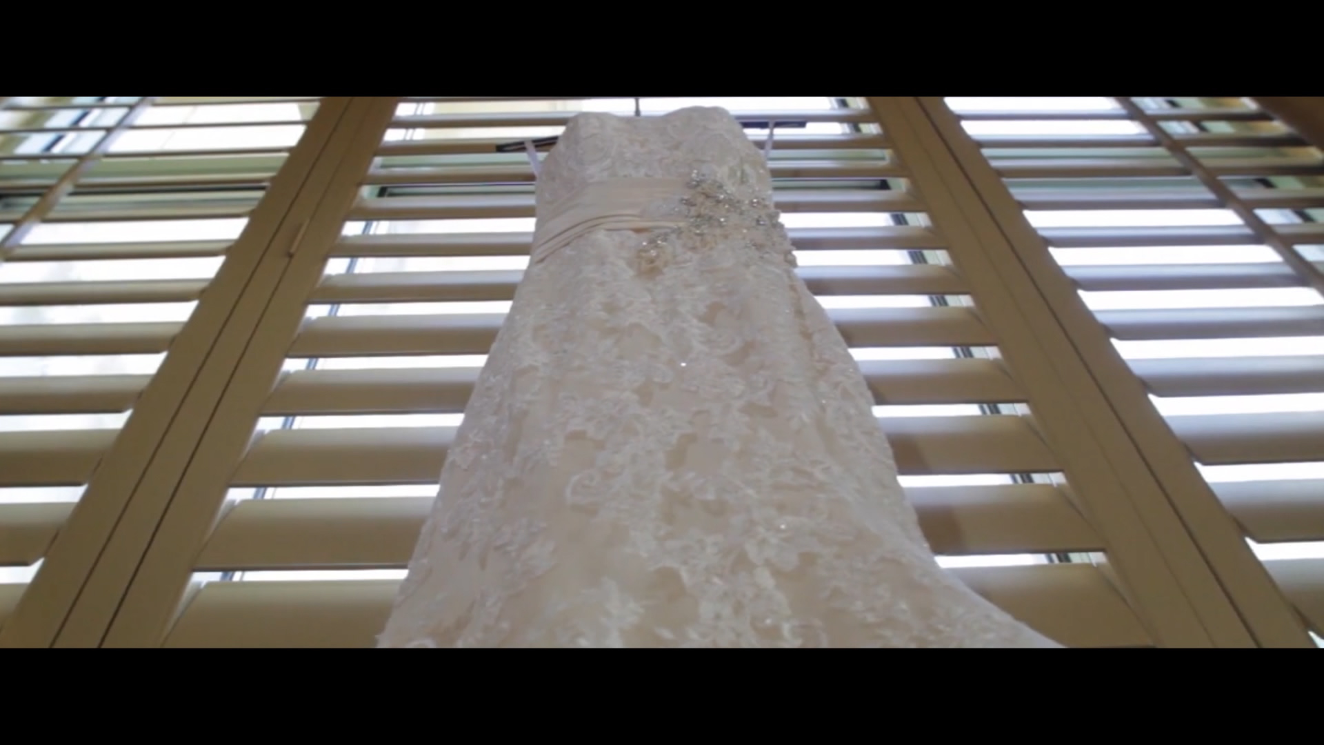
Composition refers to what you can actually see in the frame. Lens choice can make or break your compositions. Learning focal lengths and the impact lenses have in relationship to distance is an important concept the grasp. To learn more about what lenses, check out this blog: http://gaddisvisuals.com/whatlensshouldiuse/
Rule of Thirds
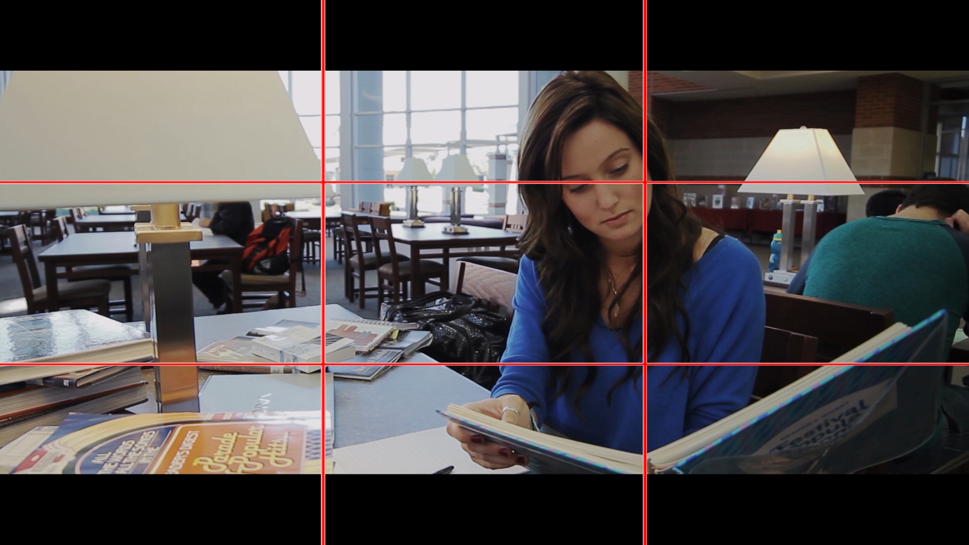
Imagine the frame with two vertical lines and two horizontal lines, as to create three vertical sections of the same dimensions and three vertical sections also of the same size. The intersections of the lines are points of interest, where important objects are often placed. Some rules are meant to be broken. However, you have to know what the rules are in order to break them in a way that works for your story. Also, you don’t have to be exactly on the lines to get interesting imagery.
Things to consider when framing compositions:
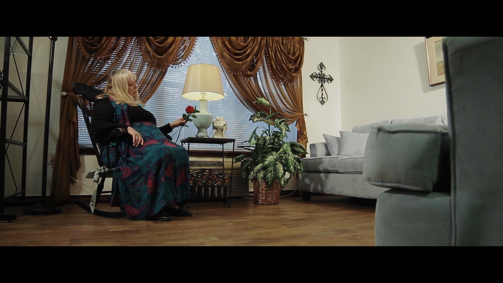
Lead Room gives the character space in the frame to look or walk in the direction they are going. Not having lead room can sometime feel off balance, like their back is against the wall. If a character is looking frame right, they should be placed frame left. Here is an example:
Head Room – One of the biggest signs of amateur work, is too much head room in frame or perhaps to little head room on a medium or wide shot. Head room refers to the amount of space there is between the talents head and the top of frame. Head room is usually framed to taste, but there is a general area you want to hit.
Balance and Symmetry – If it lends to your story or filmic style, symmetry is a great way to show control in your compositions. Symmetry, for those of you who may not know, is cutting the frame in half, and having both sides appearing the same. The cut can be horizontal or vertical and still be symmetrical.
A great example of symmetry from a master at the craft is studying Wes Anderson’s work. You can check out the link below to see how he uses symmetry.
Compositions can be affected in many ways:
Lines and Curves can help your composition tremendously if you are looking at them in your frame. They can be a powerful technique in story-telling and composition.
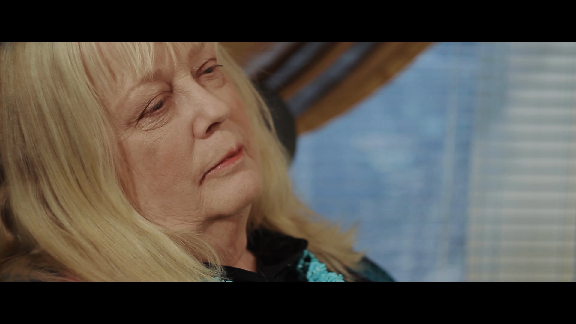
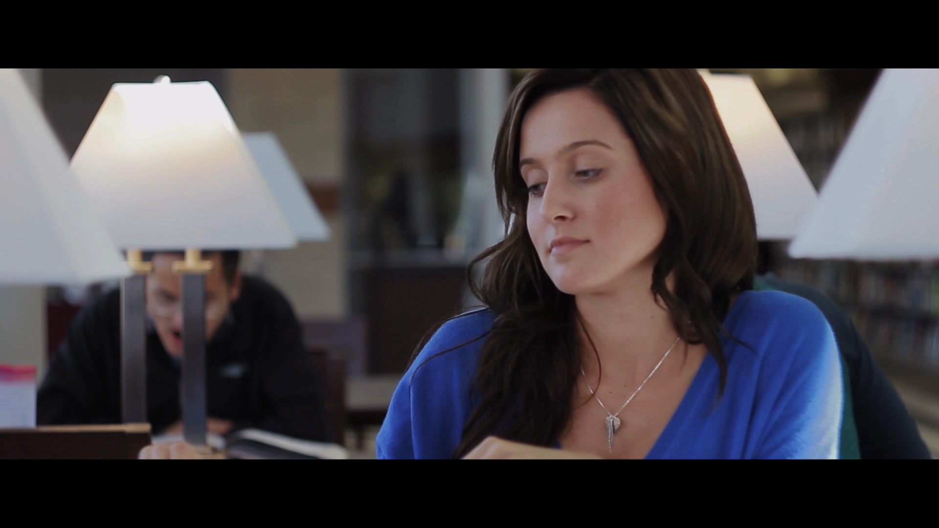
Depth of Field can draw the viewer’s eyes to certain parts of the frame. Using that knowledge can also help with story-telling.
In closing, remember to look at overlapping elements in your frame. If you have a character standing in front of a single tree, make sure it doesn’t look like the tree is growing out of the character’s head. Sometimes it is better to walk around and take a few pics to find your frame versus bringing your camera system with rig and rails trying to find it. You can also, use that picture as a reference for you crew so they know what you are looking for and what the camera will be seeing. Mastering film composition is a life-long process. Some people are born with an artistic eye. With some people, it takes a lot of training. Both cases end up with great film composition.
If you have any questions, feel free to leave a comment or email me directly: info@gaddisvisuals.com
