Color can also communicate emotional information. For example warm lighting can convey safety and cool lighting to suggest danger are about as standard as shadows to convey mystery and brightness to signify security.
Color Theory starts with the color wheel. This should look familiar to anyone with experience of a 3 way color corrector.
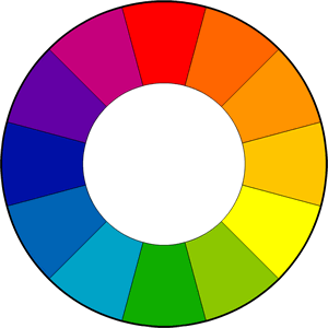 The color wheel is the common tool you will see when it comes to color control, and it is standard in color theory in defining a nu
mber of combinations that are considered pleasing.
In a simplified form the color wheel comprises 12 colors based on the RYB (or subtractive) color model.
In the RYB color model, the primary colors are red, yellow and blue. The three secondary colors are green, orange and purple, and can be made by mixing two primary colors. A further six tertiary colors can be made by mixing the primary and secondary colors.
Let’s make some sense of this. Firstly you’ll notice warmer colors on the right side, and cooler colors on the left. Warm colors are bright and energetic. Cool colors give a soothing and calm impression. We will quickly define the common color harmonies or color chords, each consists of two or more colors within a specific pattern or relationship on the color wheel.
1. Complementary Color Scheme
Two colors on opposite sides of the color wheel make a complimentary pair. This is by far the most commonly used pairing. A common example is orange and blue, or teal. This pairs a warm color with a cool color and produces a high contrast and vibrant result. Saturation must be managed but a complimentary pair are often quite naturally pleasing to the eye.
2. Analogous Color Scheme
Analogous colors sit next to each other on the color wheel. They match well and can create a overall harmony in color palette. It’s either warmer colors, or cooler colors so it doesn’t have the contrast and tension of the complementary colors.
3. Triadic Color Scheme
Triadic colors are three colors arranged evenly spaced around the color wheel. One should be dominant, the others for accent. They will give a vibrant feel even if the hues are quite unsaturated.
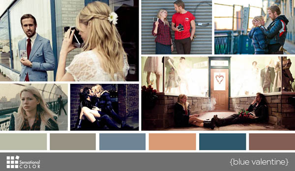
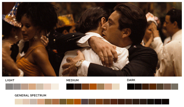
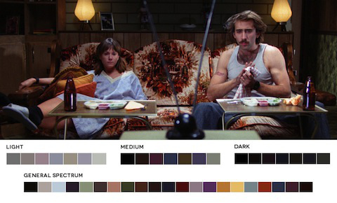
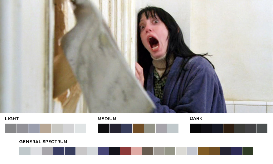
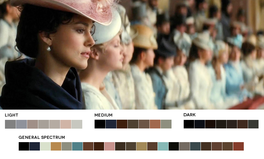
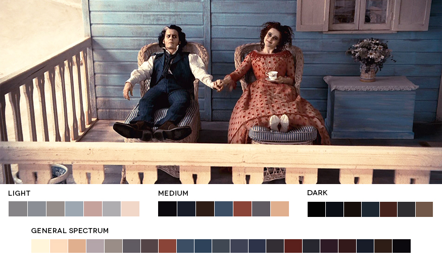
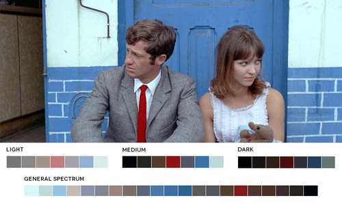
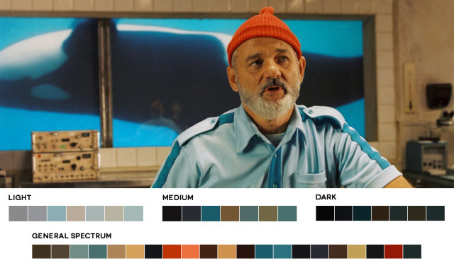
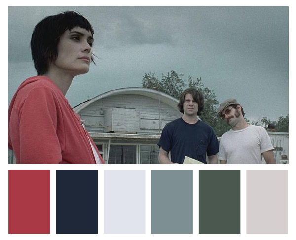
All of the frame grabs used to illustrate the 5 most common schemes were created by graphic designer Roxy Radulescu from her site www.moviesincolor.com. It’s worth taking some time to look through all the work she has done.
