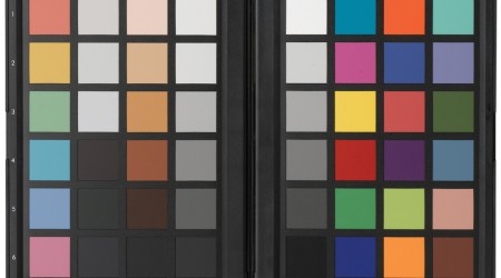
Additive color is light created by mixing together light of two or more different colors. RGB are the primary colors normally used in additive color systems.
Subtractive color uses, dyes, inks, or filters to absorb some wavelengths of light and not others.
Additive and Subtractive color is the reason why adding all the colors in the spectrum of light creates white (additive), will combing all the colors in paint creates black (subtractive).
Color can be described in 3 ways:
- The Hue, which is the color itself.
- The Saturation, which is the intensity of the color.
- The Value, which is the lightness and darkness of a color.
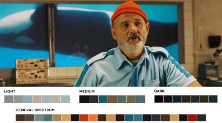
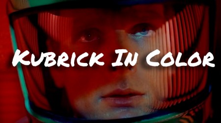
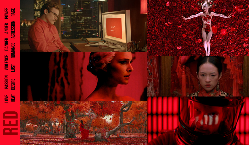
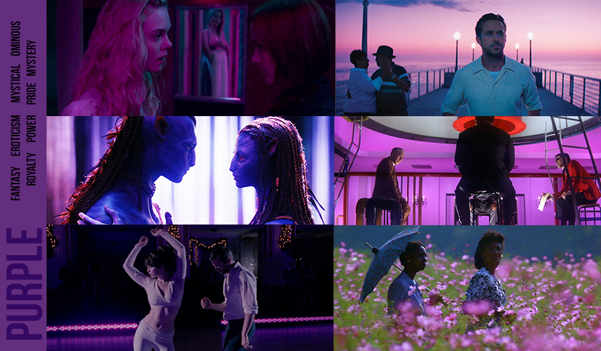
Check out how color has been used in these films:
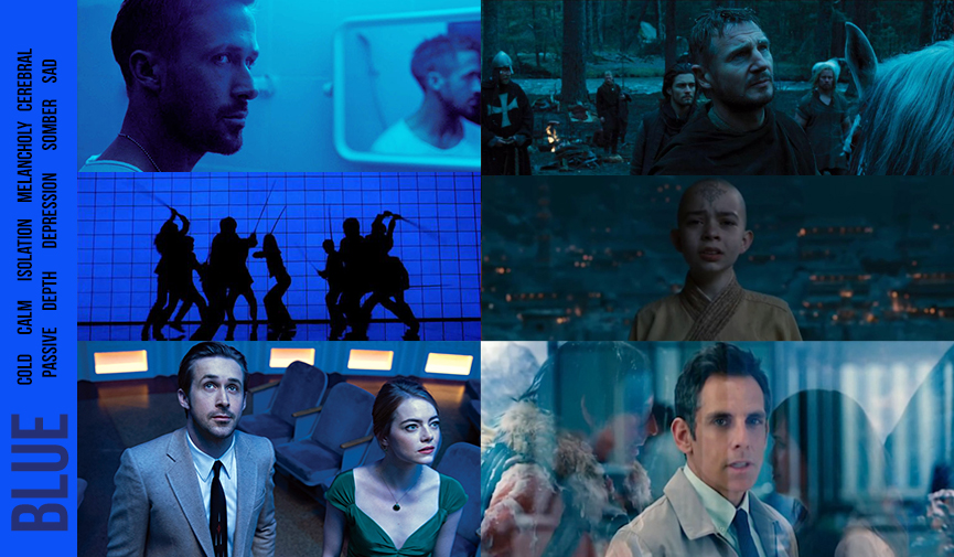
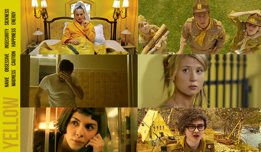
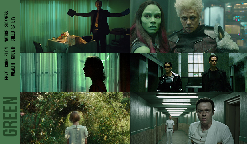
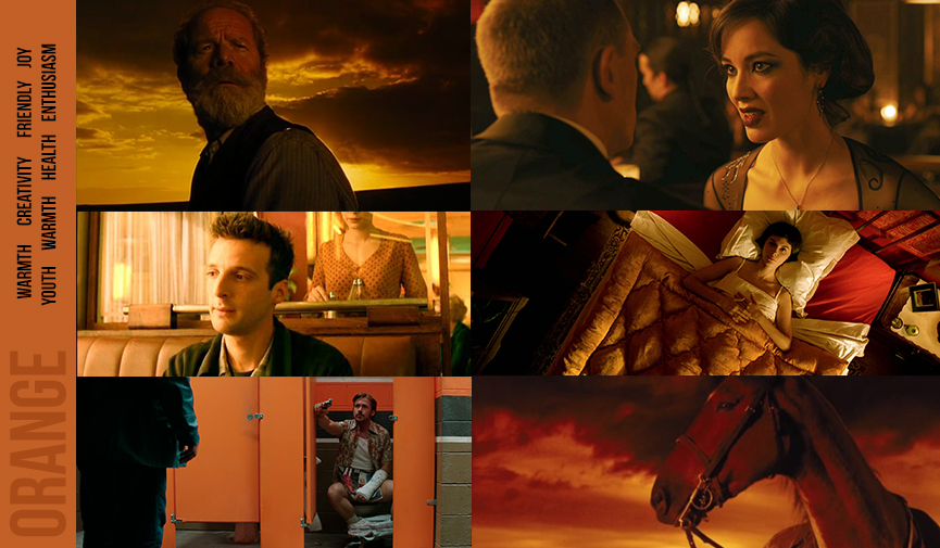
Color from a film theory perspective
Humans have been conditioned to perceive certain colors differently than others. We also assign emotions to colors whether we know it or not. If I say think of something red, you may think of a heart, you may start to feel love/passion, or you may think of a stop sign which causes you to pause. So just in that one color example, I am able to communicate so much just from one color.
Color can affect us emotionally, psychologically, without us being aware of it. Color in film can complete change the tone of a scene. Here are some of the ways you can use color:
- Elicit psychological reactions with the audience
- Draw focus to significant details
- Set the tone of the movie
- Represent character traits and more
- Show changes or arcs in the story
As a filmmaker, choose your film palette carefully to maximize emotional effect.
Associative Colors in film means that the writer, director, or artist associates a color with a character, emotion, or theme. You can also use color as a transition in the story line. Transitional colors can represent a change in a character or theme.
“The color scheme is the combination of multiple colors to communicate the thematic context.”
A great resource to see the different color schemes in film is www.moviesincolor.com.
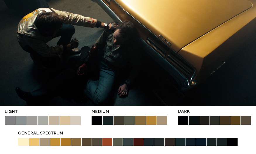
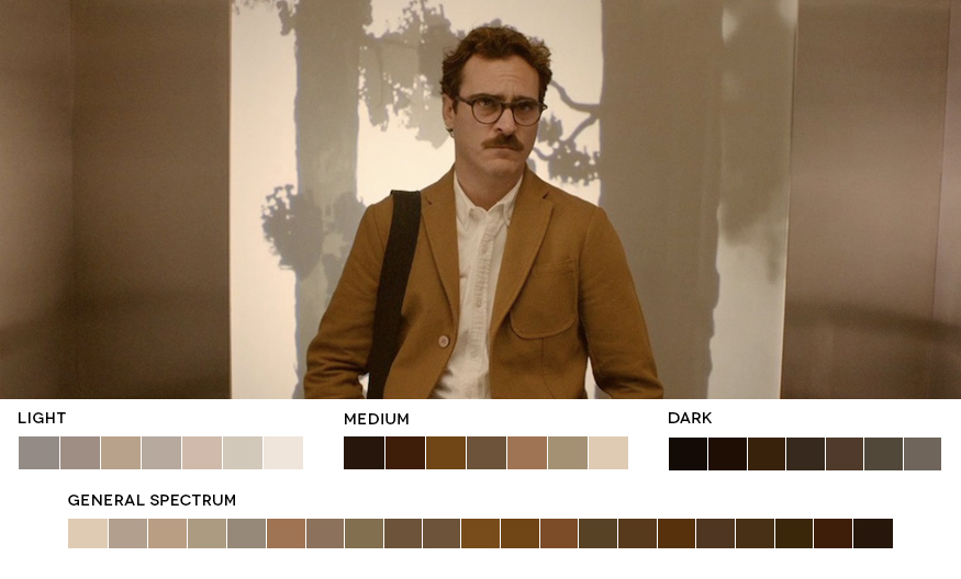
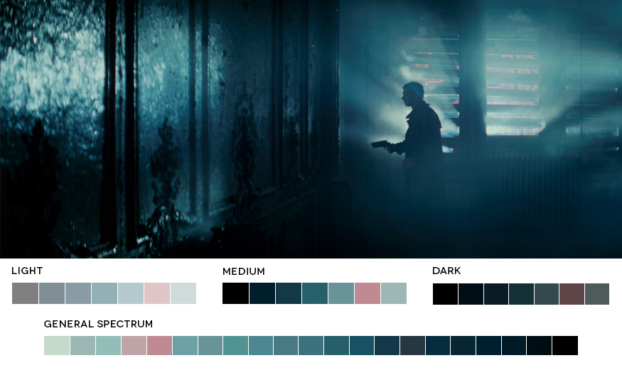
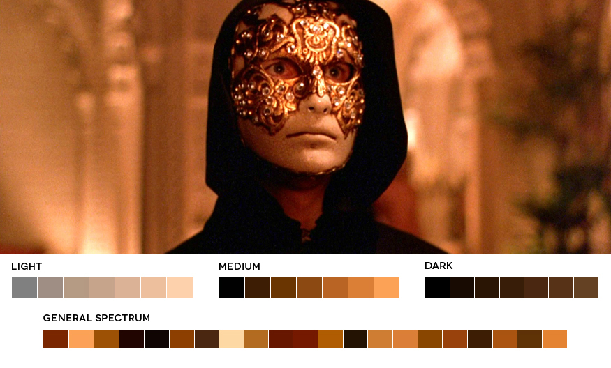
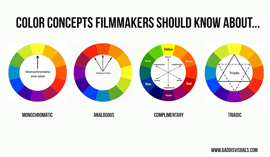
The four most common types of balanced color schemes are Monochromatic, Analogous, Complementary, and Triadic.
Discordant Colors are any deviations from the film’s color scheme. This is often used to refocus viewer’s attention to an important person, place, or thing. It can also help a character, detail, or moment stand out from the rest of the film.
Understanding color is an important part of film-making. You must not only learn what color does, but also use and apply that knowledge.
Canva Color Theory has an amazing color wheel as a resource. If you want a quick and easy way to find out what colors go with or don’t, go here.
Thank you for reading: If you want more content like this be sure to support the blog on Patreon. If you have any questions, ask me in the Capturing Light Community on Facebook. I would love to hear from you. https://www.facebook.com/groups/capturinglightcommunity


